Introduction
This chapter is about interaction with the graphical user interface of MADRIX in addition to just writing a source code. In this way, working with elements of the GUI (graphical user interface) expands the options of the MAS Script Effect further. You will have the possibility to set values a script should use, such as a color or the text to write. MADRIX Script provides several GUI elements, which can be placed on the effects dialog. The picture below exemplarily shows the available graphical elements.

Exemplary GUI Elements of the MAS Script Effect
As you can see, it is possible to create additional elements. For example, there is a text field to enter text, a color control to select a color, a slider, and a button. Each different element will be placed in a new line.
Creating GUI Elements
Creating a GUI element within MADRIX Script is as simple as declaring a variable. The corresponding element is created automatically. You just have to declare a type of element and a variable/name for it. Here is how it generally looks like:
ctrledit myText;
ctrlcolor myColor;
ctrlslider mySlider;
ctrlbutton myButton;
MADRIX Script will create the elements on the effect dialog and they can be utilized right away. Since GUI elements should last as long as the script is loaded, those variables need to be global.
Please note: You cannot create local variables of those types. GUI elements have to be global! Furthermore, it is not possible to declare such variables as persistent. But their values will always be stored and reloaded automatically. It is also not allowed to copy or assign variables of those types.
Within MADRIX Script those data types are simple structures. Hence, you can initialize them like any other structures. The particular structures are described below. Here is an example with global variables which creates the GUI shown above:
ctrledit myText = {"Text", EDIT_ALIGN_LEFT, "MADRIX"};
ctrlcolor myCol = {"Color", MADRIX_GREEN};
ctrlslider mySlider = {"Range", 100, 150, 200};
ctrlbutton myButton = {"Button", "OnButton"};
Explanation:
| ▪ | This source code creates each GUI elements and initializes them with specific values. |
| ▪ | The first value always represents the description that is used to label the corresponding element. |
| ▪ | Then, several values may follow which are different for each structure. |
| ▪ | For example, the slider is initialized with a range of 100 to 200 and starts with value of 150. |
Using GUI Elements
Overview
After creating an element, it can be used like controls of the same kind in MADRIX. A slider can be moved by using the mouse or by writing a value into the edit field next to it, etc. The script can access these values via the different elements of the corresponding structure. The table below shows those structures in detail:
Structure |
Entries |
GUI Element/Description |
||||||||||||||||||||||||||||||||||||||||||||||||||||||
|---|---|---|---|---|---|---|---|---|---|---|---|---|---|---|---|---|---|---|---|---|---|---|---|---|---|---|---|---|---|---|---|---|---|---|---|---|---|---|---|---|---|---|---|---|---|---|---|---|---|---|---|---|---|---|---|---|
|
|
|
ctrlbutton provides a button. A function must be assigned that is called whenever the button was pressed. This is done by assigning the name of the function to the proc element of a ctrlbutton variable. The set function must be of the type void function().
The tooltip member holds the tooltip for the button, which is shown when the user holds the mouse over the button for some seconds.
|
||||||||||||||||||||||||||||||||||||||||||||||||||||||
ctrlbutton2
|
|
ctrlbutton2 provides two buttons in one line. For each button a function must be assigned, which is called whenever the corresponding button has been pressed. This is done by assigning the name of the function to the proc[n] element of a ctrlbutton variable. The function set must be of the type void function().
The tooltip members hold the tooltip for the buttons, which is shown when the user holds the mouse over a button for some seconds.
|
||||||||||||||||||||||||||||||||||||||||||||||||||||||
ctrlbutton3
|
|
ctrlbutton3 provides three buttons in one line. For each button a function must be assigned, which is called whenever the corresponding button has been pressed. This is done by assigning the name of the function to the proc[n] element of a ctrlbutton variable. The function set must be of the type void function().
The tooltip members hold the tooltip for each button, which are shown when the user holds the mouse over a button for some seconds.
|
||||||||||||||||||||||||||||||||||||||||||||||||||||||
|
|
|
ctrlbutton4 provides four buttons in one line. For each button a function must be assigned, which is called whenever the corresponding button has been pressed. This is done by assigning the name of the function to the proc[n] element of a ctrlbutton variable. The function set must be of type void function().
The tooltip members hold the tooltip for each button, which are shown when the user holds the mouse over a button for some seconds.
|
||||||||||||||||||||||||||||||||||||||||||||||||||||||
|
|
|
ctrlbutton5 provides five buttons in one line. For each button a function must be assigned, which is called whenever the corresponding button has been pressed. This is done by assigning the name of the function to the proc[n] element of a ctrlbutton variable. The function set must be of type void function().
The tooltip members hold the tooltip for each button, which are shown when the user holds the mouse over a button for some seconds.
|
||||||||||||||||||||||||||||||||||||||||||||||||||||||
|
|
|
ctrlbutton6 provides six buttons in one line. For each button a function must be assigned, which is called whenever the corresponding button has been pressed. This is done by assigning the name of the function to the proc[n] element of a ctrlbutton variable. The function set must be of type void function().
The tooltip members hold the tooltip for each button, which are shown when the user holds the mouse over a button for some seconds.
|
||||||||||||||||||||||||||||||||||||||||||||||||||||||
|
|
|
ctrlcolor provides a color input control with the Color Picker and five edit fields to enter the red, green, blue, white, and alpha values.
The alpha value will not be provided/set by the Color Picker.
|
||||||||||||||||||||||||||||||||||||||||||||||||||||||
|
|
|
ctrledit provides an edit control which allows to enter a text or values.
The variable align can be set to one of the following values: EDIT_ALIGN_LEFT,
|
||||||||||||||||||||||||||||||||||||||||||||||||||||||
ctrledit2
|
|
ctrledit2 provides two edit controls in one line to enter text or values.
The variable align can be set to one of the following values: EDIT_ALIGN_LEFT,
|
||||||||||||||||||||||||||||||||||||||||||||||||||||||
ctrledit3
|
|
ctrledit3 provides three edit controls in one line to enter text or values.
The variable align can be set to one of the following values: EDIT_ALIGN_LEFT,
|
||||||||||||||||||||||||||||||||||||||||||||||||||||||
|
|
|
ctrledit4 provides four edit controls in one line to enter text or values.
The variable align can be set to one of the following values: EDIT_ALIGN_LEFT,
|
||||||||||||||||||||||||||||||||||||||||||||||||||||||
|
|
|
ctrledit5 provides five edit controls in one line to enter text or values.
The variable align can be set to one of the following values: EDIT_ALIGN_LEFT,
|
||||||||||||||||||||||||||||||||||||||||||||||||||||||
|
|
|
ctrledit6 provides six edit controls in one line to enter text or values.
The variable align can be set to one of the following values: EDIT_ALIGN_LEFT,
|
||||||||||||||||||||||||||||||||||||||||||||||||||||||
|
|
|
ctrlslider provides a slider with a predefined range. Like shown in MADRIX, a slider is represented by an edit control to enter a value as well as a slider control.
You can set a range for the slider. The minimum value (rangeMin) has to be greater or equal to 0, while the maximum value (rangeMax) must be greater than the minimum value. If value itself is set to a value outside the range, it is automatically set to the minimum or maximum value.
The tooltip is shown when the user leaves the mouse over the slider for some seconds.
|
||||||||||||||||||||||||||||||||||||||||||||||||||||||
|
|
|
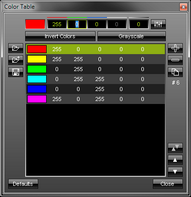
ctrlcolortable provides a color table dialog to set a number of colors. On the GUI of the effect, a button is provided to open the color table dialog. The label description is used to mark the button.
The tooltip is shown when the user holds the mouse over the button that opens the color table for some seconds.
|
Retrieving Values From GUI Elements
In order to receive values from a GUI element, it is simply necessary to read the appropriate value from the corresponding variable. The following example for the MAS Script Effect demonstrates that:
@author="";
@version="";
@description="";
ctrlcolor col = {"Color",AQUA}; //create color control
ctrlslider chgB = {"Fade", 0, 5, 150, "The value used to dim the lines"};
//create slider
void InitEffect()
{
}
void RenderEffect()
{
//create a color structure for ChangeBrightness with the value set by the slider
color chg = {0, 0, 0, 0, chgB.value}; // increase alpha value continuously
ChangeBrightness(chg);
float f = frandom();
//draw a line with the color set by the color control
DrawVectorLine(col.value, f, 0.0, f, 1.0);
}
Explanation:
| ▪ | This exemplary effect randomly draws lines onto the matrix and a fade out is added. |
| ▪ | First, one color control and one slider control are created in addition to the standard speed control. The color control is used to set the color of the lines. The slider is used to determine the fading time. |
| ▪ | In the function RenderEffect(), first, the variable chg of the type color is created. Its Alpha value is set by the value provided by the slider chgB. Then, ChangeBrightness() is called in order to fade out the current content of the matrix. |
| ▪ | Finally, a line is drawn using the color value of the color control. |
Setting Values Of GUI Elements
Just as it is possible to read the value, description, or range of a GUI element, it is also possible to set those values. In this way, it is possible to change the range of a slider, the text of an edit, or even their descriptions. You just have to set the corresponding value of the appropriate variable. Here is an example for the MAS Script Effect:
@author="";
@version="";
@description="";
ctrlcolor col = {"Color", FUCHSIA};
ctrlslider t = {"Fade", 0, 5, 10};
void InitEffect()
{
}
void RenderEffect()
{
col.value.a += t.value; //count up alpha value
if(col.value.a > 255) //if necessary reset it
col.value.a = 0;
Clear(col.value); //clear matrix
}
Explanation:
| ▪ | In this example the matrix is cleared with a predefined color and the alpha constantly changes in order to render the effect more and more transparent. |
| ▪ | A color control is created to change the color in use and a slider allows users to define how fast the color becomes transparent. |
| ▪ | When the color is fully transparent, it is reset to no transparency at all. |
| ▪ | In order to accomplish this effect, the script continually increases the alpha value set by the color control. |
| ▪ | You will see how the alpha value counts up by each frame and is reset to 0, after it has reached the maximum value of 255. |
Buttons are created like any other GUI element by declaring a global variable of one of the ctrlbutton elements. In order to use a button, it is necessary to assign a function which is called when the button has been pressed. Those functions must be of the following type:
void <function name>()
In order to assign such a handler function, the name of the according function must be assigned to the proc-element of the according variable. In theory it could look like this:
ctrlbutton btn;
void InitEffect()
{
btn.proc = "OnBtn";
btn.tooltip="A button";
}
void OnBtn()
{
do something after button was pressed
}
If the assigned function does not exist or does not have the correct return type or parameter list, a warning is displayed in the Script Output of the Script Editor.
Examples
The following example for the MAS Script Effect creates four buttons. Pressing a button will activate the color indicated by the button (Red, Green, Blue, or White).
@scriptname="ColorTestWithButton";
@author="inoage info@madrix.com";
@version="v1.0-2010/03/31";
@description="Create buttons that set the color of the matrix";
ctrlbutton ButtonRed = {"Red", "OnRed"};
ctrlbutton ButtonGreen= {"Green", "OnGreen"};
ctrlbutton ButtonBlue = {"Blue", "OnBlue"};
ctrlbutton ButtonWhite= {"White", "OnWhite"};
void InitEffect()
{
ButtonRed.tooltip= "Press here to set color red";
ButtonGreen.tooltip="Press here to set color green";
ButtonBlue.tooltip= "Press here to set color blue";
ButtonWhite.tooltip="Press here to set color white";
Clear();
}
void RenderEffect()
{
// do noting
}
void MatrixSizeChanged()
{
InitEffect();
}
void OnRed()
{
Clear(RED);
}
void OnGreen()
{
Clear(GREEN);
}
void OnBlue()
{
Clear(BLUE);
}
void OnWhite()
{
Clear(WHITE);
}
The following example for the MAS Script Effect provides two buttons. By pressing the first button, blinking is started and stopped. Pressing the second button selects another color. This example changes the label and the handler function of the first button.
@scriptname="";
@author="";
@version="";
@description="";
ctrlbutton g_btnMode = {"Mode: Blinking", "OnBlinkOff",
"Enable or disable blinking mode"};
ctrlbutton g_btnColor= {"Change Color", "OnColor", "Select a new color"};
const int MODE_BLINK = 0;
const int MODE_STOP = 1;
int g_mode;
int g_counter;
color g_color = RED;
void InitEffect()
{
}
void RenderEffect()
{
if(g_mode == MODE_BLINK)
{
if(g_counter++ == 10)
{
Clear(g_color);
g_counter = 0;
}
else if(g_counter++ == 5)
{
Clear();
}
}
else
{
Clear(g_color);
}
}
void OnColor()
{
g_color.r = random(0, 255);
g_color.g = random(0, 255);
g_color.b = random(0, 255);
g_color.w = random(0, 255);
}
void OnBlinkOff()
{
g_mode = MODE_STOP;
g_btnMode.label = "Blinking Off";
g_btnMode.proc = "OnBlinkOn";
g_btnMode.tooltip = "Enable blinking mode";
WriteText("Blink disabled");
}
void OnBlinkOn()
{
g_mode = MODE_BLINK;
g_btnMode.label = "Blinking On";
g_btnMode.proc = "OnBlinkOff";
g_btnMode.tooltip = "Disable blinking mode";
WriteText("Blinking enabled");
}
The following example for the MAS Script Effect draws a continuing circles an provides 4 rows, each containing 1, 2, 3, or 4 buttons. The buttons are labeled with a color. Press the according button and the displayed circles will change their color.
@scriptname="buttons";
@author="inoage";
@version="1.0";
@description="view to use button 1-4";
int height=0;
int width=0;
int i;
color col=WHITE;
ctrlbutton Button1 ={"Red","OnRed","set red color"};
ctrlbutton2 Button2 ={"Red","OnRed","Green","OnGreen","set red color", "set green color"};
ctrlbutton3 Button3 ={"Red","OnRed","Green","OnGreen","Blue","OnBlue","set red color",
"set green color","set blue color"};
ctrlbutton4 Button4 ={"Red","OnRed","Green","OnGreen","Blue","OnBlue","White","OnWhite",
"set red color", "set green color","set blue color","set white color"};
void InitEffect()
{
height = GetMatrixHeight();
width = GetMatrixWidth();
Clear();
i=0;
SetBpm(100);
}
void RenderEffect()
{
i++;
if(i>width || i>height)
{
i=0;
Clear();
}
DrawPixelCircle(col, width/2-i, height/2-i, i*2,i*2);
}
void MatrixSizeChanged()
{
InitEffect();
}
void OnRed()
{
col=RED;
}
void OnGreen()
{
col=GREEN;
}
void OnBlue()
{
col=BLUE;
}
void OnWhite()
{
col=WHITE;
}
Button Example 4 (ctrlbutton2)
The following example for the MAS Script Effect.
@scriptname="";
@author="";
@version="";
@description="";
ctrlbutton2 btn;
void InitEffect()
{
btn.label1="A";
btn.proc1="OnBtnA";
btn.tooltip1="A button";
btn.label2="B";
btn.proc2="OnBtnB";
btn.tooltip2="B button";
}
void RenderEffect()
{
}
void MatrixSizeChanged()
{
InitEffect();
}
void OnBtnA()
{
// action btn A clicked
}
void OnBtnB()
{
// action btn B clicked
}
The following example for the MAS Script Effect clears the matrix with several predefined colors. The effect provides a color table to set up these colors. This example shows how to initialize and to use a color table within a script.
@author="";
@version="";
@description="";
ctrlcolortable col = {"Color Table", {RED, GREEN, {255, 255, 128}, FUCHSIA},
"Colors used to fill the matrix"};
void InitEffect()
{
SetBpm(60);
}
void RenderEffect()
{
if(col.value.length > 0)
{
Clear(col.value[random(0, col.value.length - 1)]);
}
}
The following example for the MAS Script Effect clears the matrix with the color white. It also creates 1 edit fields to enter the color values for the red color channel. You can enter different values than 255, which is the default value of the edit field in this script. The green and blue color channel are automatically set to 255.
@scriptname="ctrledit1 sample";
@author="inoage";
@version="MADRIX 2.10";
@description="color edit via script gui";
color col=WHITE;
// create 1x edit
ctrledit editColor={"Color",EDIT_ALIGN_RIGHT,"255","color red"};
void InitEffect()
{
}
void RenderEffect()
{
col.r=(int)editColor.value;// value1 to color red via cast (int)
Clear(col);// Set color to complete matrix
}
void MatrixSizeChanged()
{
InitEffect();
}
The following example for the MAS Script Effect creates an edit field ctrledit2 and assigns strings in InitEffect().
@scriptname="ctrledit2 example";
@author="inoage";
@version="MADRIX 3.1";
@description="";
ctrledit2 edit;
void InitEffect()
{
edit.label="EDIT";
edit.align=EDIT_ALIGN_RIGHT;
edit.value1="1";
edit.tooltip1="First Edit Field";
edit.value2="2";
edit.tooltip2="Second Edit Field";
}
void RenderEffect()
{
}
void MatrixSizeChanged()
{
InitEffect();
}
The following example for the MAS Script Effect clears the matrix with the color white. It also creates 4 edit fields to enter color values for the red, green, blue, and white color channel. You can enter different values than 255, which is the default value of the edit fields in this script.
@scriptname="ctrledit4 sample";
@author="inoage";
@version="MADRIX 2.10";
@description="color edit via script gui";
color col=WHITE;
// create 4x edit
ctrledit4 editColor={"Color",EDIT_ALIGN_RIGHT,"255","255","255","255",
"color red","color green","color blue","color white"};
void InitEffect()
{
}
void RenderEffect()
{
col.r=(int)editColor.value1;// value1 to color red via cast (int)
col.g=(int)editColor.value2;// value2 to color green via cast (int)
col.b=(int)editColor.value3;// value3 to color blue via cast (int)
col.w=(int)editColor.value4;// value4 to color white via cast (int)
Clear(col);// Set color to complete matrix
}
void MatrixSizeChanged()
{
InitEffect();
}